In this post, we continue learning about the R programming interface. Making simple X-Y plots using a mathematical expression of the type
y = f(x)
is a nice way to learn how functions behave and for finding out the roots of polynomial functions. In R, the curve command can handle almost anything you wish to plot and analyze. Let’s assume that you have a function of the form:
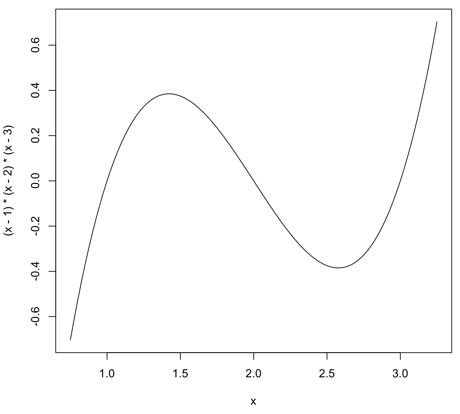
y = (x – 1)(x – 2)(x – 3)
In this case, we already know that the roots of this function [x values where y = f(x) = 0] are x = 1, x = 2 and x = 3. Thus, picking a range of x-values over which this function shows some interesting behavior is easy. Let’s pick the range from x = 0.75 to x = 3.25.
This is how you would plot this function in the X-Y plane using R:
curve((x-1)*(x-2)*(x-3),from=0.75,to=3.25)
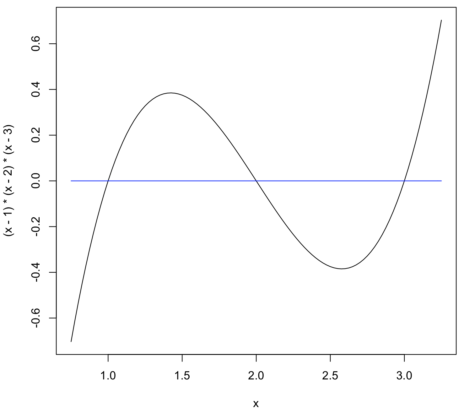
To overlay another plot on the same window, use “add = TRUE” as an additional parameter to the curve command. For example, to insert a blue-colored horizontal line (y = 0) in the above plot, use:
> curve(0*x,from=0.75,to=3.25,col='blue',add=TRUE)
You can control the number of points “n” used to draw the curve (default n = 101), add custom labels for the axes and draw logarithmic plots. Consult this link for additional details about all the parameters we can use for the curve command.